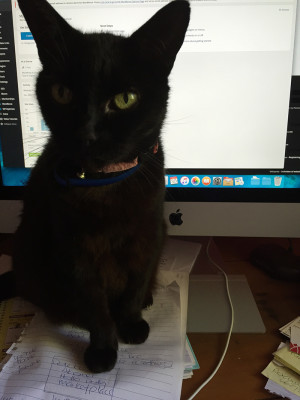
I am frequently joined at my desk by Bubba, my slightly strange cat who becomes a little more odd every year!) I think she’s telling me I need to stop!!
The Website School is a practical guided set of resources designed to help you create your own website and make it shine and thrive. You’ll be in the driver’s seat, but you’ll have access to the very same process that I follow when I create a website for one of my clients. All in plain English with checklists and downloads to help along the way!
About Me
Yes, I’m a real person (with a cat called Bubba). A website developer with more than 15 years experience and probably more than 500 websites under my belt (but I’ve actually lost count!).
I’m a designer, business owner, employee, communicator, trainer, self taught person, not a programmer, researcher … and more.
I get asked all the time for advice about websites … so many “how do you do that” questions … and it’s challenging knowing where to look, or even to know what questions to ask so you can get your website happening.
So I decided that I wanted to share the knowledge to make it as as easy as possible for you to create an awesome website for your business. And that turned into a brain dump and 15+ years of experience has been turned into a set of resources that take you through the website creation process. Starting at the beginning, with no geeky speak (I’ve kept it to an absolute minimum!).
I should also say here that I do have a website design business and love working with local businesses on their websites, social media, print work etc (you can read about that here).
About this Website
I’ve created this website from using WordPress, free and premium plugins and minimal customisation. I wanted to be able to demonstrate that you can make your website look professional without having to know stuff like php, js, html and css which is often rattled off by developers and it’s just confusing!
I have to confess there is a teeny bit of customisation which was unavoidable because the site falls into the “specialised” membership site with an online payments with particular workflows, yada yada yada … and I’m a bit of a perfectionist! But I hasten to add, this isn’t necessarily the typical site, but not out of the realms of the kind of customisation you may need to do if you’re planning an online store, or your own membership site.
You might also notice that there’s something odd about the site in that there’s minimal navigation! It’s my way of keeping things usable while some elements are taking shape!
Core setup
- WordPress (with a child theme)
Plugins
I will generally only use free plugins that are available from the WordPress repository and for 99.9% of websites I create, I use a standard set of plugins as a starting point. This isn’t a complete list, but for this site, I’ve used (amongst others):
- Antispam Bee
- Broken Link Checker
- Bloom, Monarch(are part of the Elegant Themes theme licensing)
- Jetpack
- MemberPress
- Ninja Forms
- Wordfence Security
- WP Optimize
- Yoast SEO
Themes
Like plugins, I have favourite themes! I’ve been using (premium) Elegant Themes for some time now, and for this site I’ve flipped between two templates, but have settled on their newest theme, ‘Extra‘, rather than my all time favourite theme, Divi (just for a change!).
Images and Graphics
All purchased or sourced from a variety of image libraries, along with some purchased Photoshop files. Absolutely no “oh I just Googled it” here! More links will be available in a resources library.
- 365PSD.com
- deathtothestockphoto.com
- dreamstime.com
- freeimages.com
- kozzi.com
- mockupdeals.com
- stocksnap.io
So, whilst it may seem like a LOT of stuff, these are my tools of the trade, and I use many of them daily. I’m sharing these here because I’m a total stickybeak when it comes to websites, houses (especially kitchens and bathrooms), shoes, gardens …. and I know some of you will be too!
